
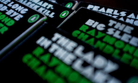
Limited edition reprint of the first 10 Penguin Classics ever printed. Photograph: Sarah Lee for the Guardian
Returning home from a weekend with Agatha Christie in 1934, Allen Lane stood on a platform at Exeter station looking for a good read for the journey. There were none, and it was from this frustration that he founded Penguin Books. His driving idea was that his paperbacks should be sold at the same price as a packet of cigarettes – and have just as much appeal.
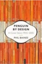
Penguin by Design: A Cover Story 1935-2005
 "Good design is no more expensive than bad," Lane declared, a mantra that has guided the publisher ever since. Considering illustrations to be trashy, he set a simple thee-part grid, with colour coded bands – orange for fiction, green for crime, blue for biographies and pink for travel and adventure – while text was set in crisp Gill Sans and strictly marshalled into the centre.
This rigorous application of colour and geometry, as well as that wonky penguin, hastily drawn from life at London Zoo by the office junior, put design right at the centre of the brand from the very beginning.
"Penguin stood for a democratisation of design," says Phil Baines, professor of typography at Central Saint Martins and author of Penguin by Design. "It marked a change in perception, that design wasn't just for monied people any more. And they were always ahead of the game, always hiring the best people."
The arrival of German typographer Jan Tschichold in the 1950s and Italian art director Germano Facetti in the 1960s defined the innovations of these decades. Tschichold introduced a set of Composition Rules and strict guidelines for the brand identity, designing covers for Kenneth Clark's Modern Painters and the Shakespeare Series.
Facetti, who had worked for Domus magazine and Olivetti, sought out a new wave of emerging British talent in the 60s, including Alan Fletcher, Colin Forbes and Derek Birdsall, producing a series of covers that came to define London's fledgling graphic design scene. He dismissed the approach of commissioning designs on a title-by-title basis as "the arty-crafty approach of the single beautiful achievement". For him, the consistency of Penguin's corporate identity was paramount.
"There was an almost paranoid obsession with the brand," says Baines, who attributes its iconic success to Lane's controlling fixation with Penguin's image. Designer Romek Marber developed perhaps the most enduring grid of all, beginning with the crime series in the 60s, which gave illustrators absolute freedom, but retained a certain order at the top of the page.
"The grid was important as the rational element of control," recalled Marber in a lecture in 2007. "The consistency of the pictures contributed, as much as the grid, to the unity of the covers, and the dark shadowy photography gave the covers a feel of crime."
His crime series stuck to a strict palette of green, overlaid with powerful black photographs, manipulated in various ways.
"For The Case of the Caretaker's Cat by Erle Stanley Gardner, the black photos of cats and the hand with a dribble of black ink give the image an ominous, rather creepy feeling," says Marber. "You wouldn't say: 'What lovely two pussies.'"
Penguin by Design: A Cover Story 1935-2005
"Good design is no more expensive than bad," Lane declared, a mantra that has guided the publisher ever since. Considering illustrations to be trashy, he set a simple thee-part grid, with colour coded bands – orange for fiction, green for crime, blue for biographies and pink for travel and adventure – while text was set in crisp Gill Sans and strictly marshalled into the centre.This rigorous application of colour and geometry, as well as that wonky penguin, hastily drawn from life at London Zoo by the office junior, put design right at the centre of the brand from the very beginning.
"Penguin stood for a democratisation of design," says Phil Baines, professor of typography at Central Saint Martins and author of Penguin by Design. "It marked a change in perception, that design wasn't just for monied people any more. And they were always ahead of the game, always hiring the best people."
The arrival of German typographer Jan Tschichold in the 1950s and Italian art director Germano Facetti in the 1960s defined the innovations of these decades. Tschichold introduced a set of Composition Rules and strict guidelines for the brand identity, designing covers for Kenneth Clark's Modern Painters and the Shakespeare Series.
Facetti, who had worked for Domus magazine and Olivetti, sought out a new wave of emerging British talent in the 60s, including Alan Fletcher, Colin Forbes and Derek Birdsall, producing a series of covers that came to define London's fledgling graphic design scene. He dismissed the approach of commissioning designs on a title-by-title basis as "the arty-crafty approach of the single beautiful achievement". For him, the consistency of Penguin's corporate identity was paramount.
"There was an almost paranoid obsession with the brand," says Baines, who attributes its iconic success to Lane's controlling fixation with Penguin's image. Designer Romek Marber developed perhaps the most enduring grid of all, beginning with the crime series in the 60s, which gave illustrators absolute freedom, but retained a certain order at the top of the page.
"The grid was important as the rational element of control," recalled Marber in a lecture in 2007. "The consistency of the pictures contributed, as much as the grid, to the unity of the covers, and the dark shadowy photography gave the covers a feel of crime."
His crime series stuck to a strict palette of green, overlaid with powerful black photographs, manipulated in various ways.
"For The Case of the Caretaker's Cat by Erle Stanley Gardner, the black photos of cats and the hand with a dribble of black ink give the image an ominous, rather creepy feeling," says Marber. "You wouldn't say: 'What lovely two pussies.'"
- Penguin covers through the years
The best of the famous publishing house's jacket designs – from the classic colour bands to illustrations by Banksy and Shepard Fairey
No comments:
Post a Comment